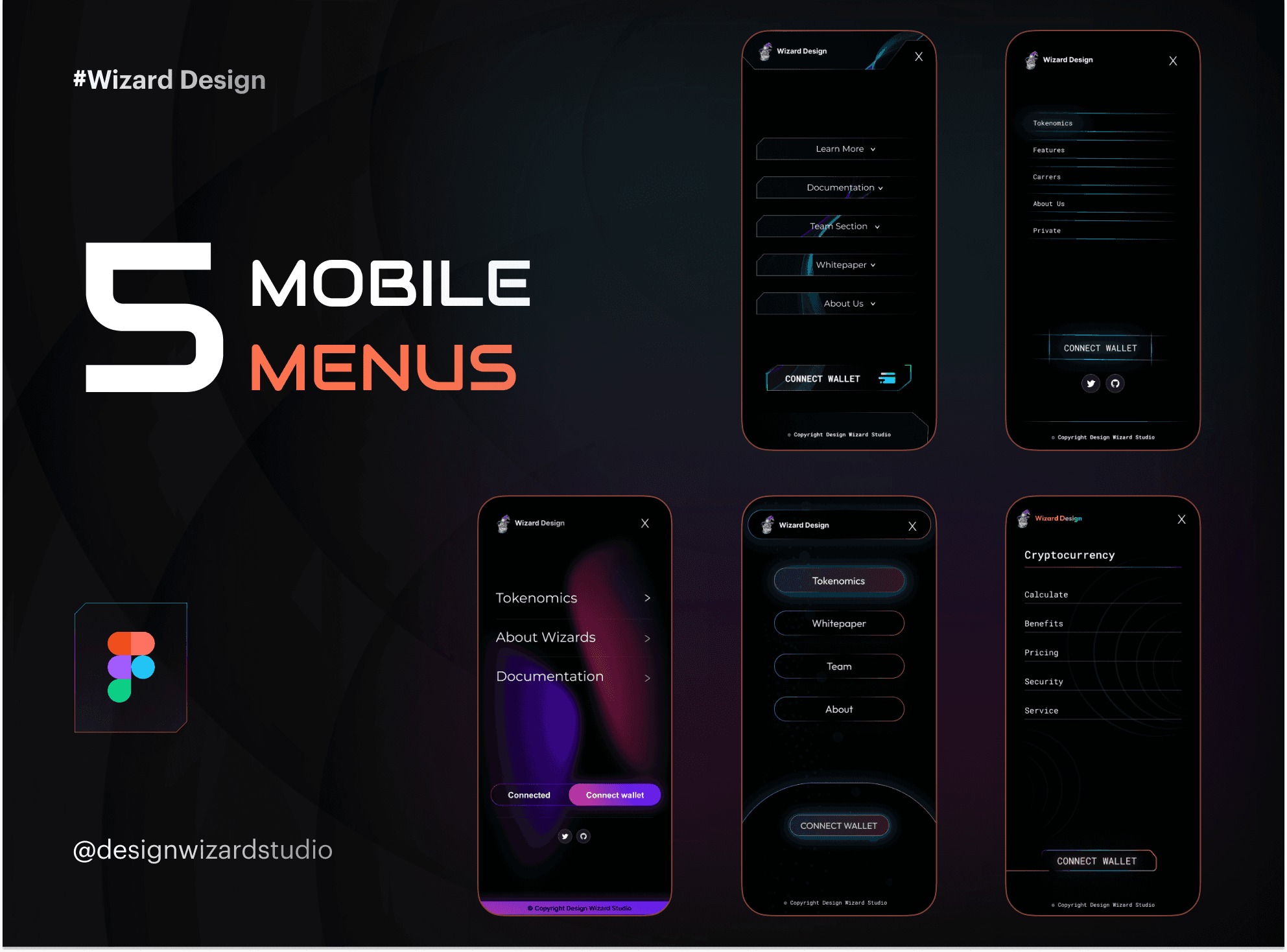
Introducing 5 Mobile Navigation Menus, a versatile and user-friendly Figma template designed to enhance your mobile app’s navigation. This template is perfect for improving your app's user experience, providing a sleek and effective way to guide users through your content. With 5 Mobile Navigation Menus, you get a set of intuitive and responsive designs that cater to the needs of today’s mobile users.
Key Features:
Sleek and Functional Design:
5 Mobile Navigation Menus offers a modern and clean design, giving your app a polished look while ensuring easy navigation. Each menu is thoughtfully designed to be both visually appealing and practical, making it simple for users to find what they need.
User-Friendly Experience:
Navigate effortlessly through the template’s well-organized menus. 5 Mobile Navigation Menus is crafted to provide a smooth and enjoyable experience, helping users engage with your app quickly and efficiently.
Responsive Across Devices:
Your app needs to perform well on any mobile device. 5 Mobile Navigation Menus ensures that your navigation looks great and works perfectly across all screen sizes, from smartphones to tablets.
Why Choose Mobile Navigation Menus?
Mobile Navigation Menus goes beyond basic functionality – it’s designed to improve your app’s usability and user satisfaction. With its clean design and powerful features, this template is a valuable tool for creating an engaging mobile experience. Elevate your app’s navigation and ensure your users enjoy a seamless journey through your content. Transform your mobile interface today with 5 Mobile Navigation Menus!


